
THE VINYL CORNER
EPISODE 8
People love the sound of music when played on a vinyl record. There are many audiophiles [like myself] who love collecting vinyl records and there are even some that are worth a ton of money. But how did vinyl records get their start? Or at least a small part of the history. In 1948, Columbia Records released their 33 ⅓ RPM, which is made from PVC or polyvinyl chloride. The sound is recorded in the grooves in the vinyl. While the record spins, the needle runs along the grooves and passes the information to the electromagnetic head. The compact disc, invented in 1982, made vinyl records obsolete. The CD was able to play the music without the pops and scratchiness of the vinyl, and they were easier to carry around than the large records. Sadly for the vinyl enthusiasts most major labels stopped producing records and turned to digital downloads. Because of the collectability of the vinyl record a lot of record labels started to bring back vinyl, and sales have been incredible. Some people claim the sound is incomparable when you hear music on vinyl. Whatever your views are on vinyl records, they are back and bigger than ever!
Why I started this VINYL corner??

To shed some light on new releases like WET’s latest vinyl release ‘Retransmission’ (Frontiers Music). Just like their previous album this album again comes with a gatefold cover. The artwork/compositing for the album was done by Anders Fastader of Tailermade Production. The satellites front cover image and the inner side are all Stock photo’s (!?!) and can be found on Dreamstime.com.
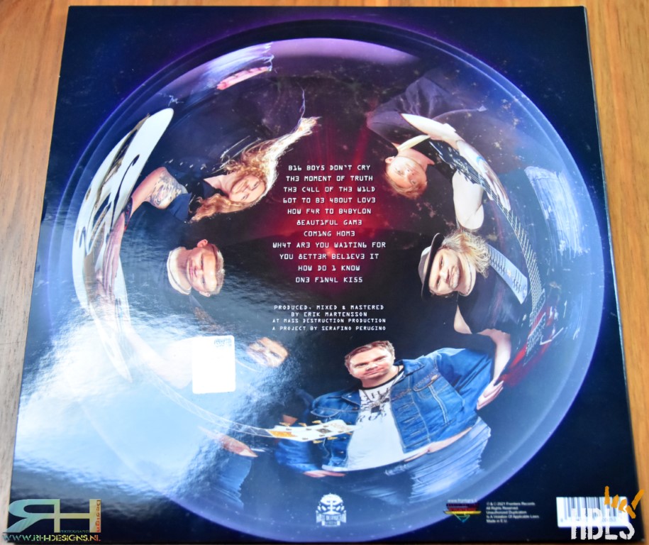
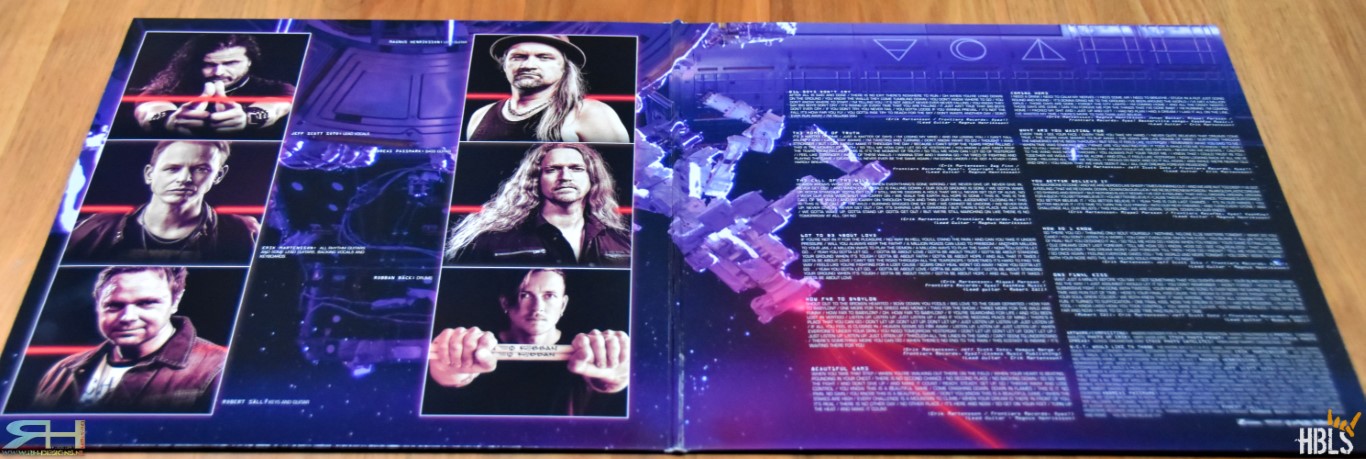
The back cover holds all the song titles and production details. As well as a fisheye like photo of all the members. The inner side of the gatefold sleeve has images of the band members and the right side contains of all the lyrics to the songs and credits.
I do wonder why they decided for this artwork and not something more exiting like on their 2013 ‘Rise Up’ release.
Based on this artwork I wouldn’t have chosen to buy this release. Of course the music is the most important here but artwork that also matches the music would really be a big plus.
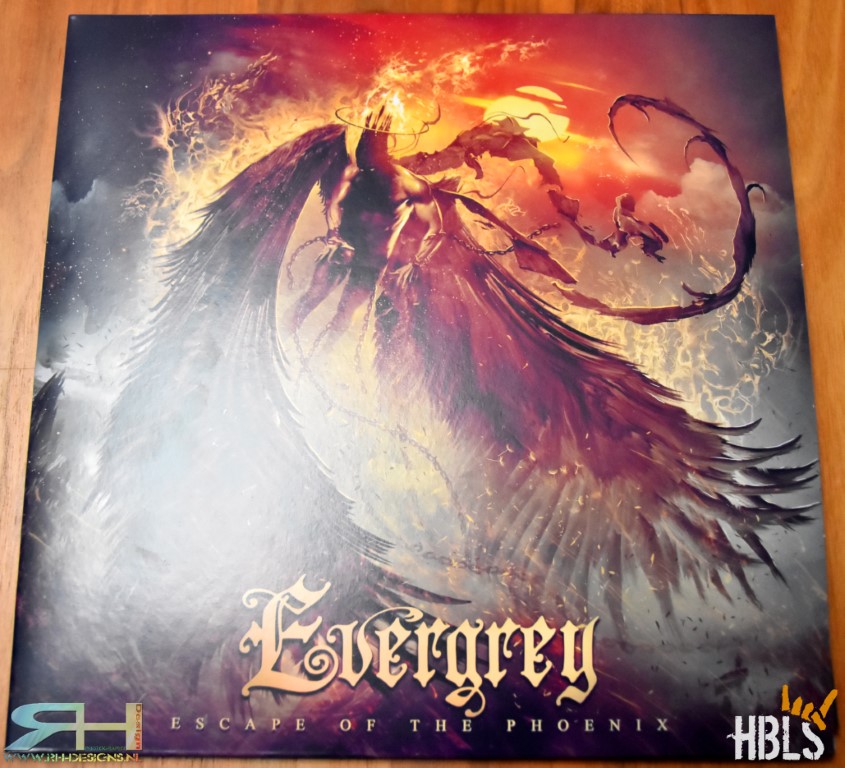
The second release for this edition is Evergrey’s ‘Escape Of The Phoenix’ (AFM Records). The beautiful artwork for this 2-vinyl gatefold release was done by the Greek Giannis Nakos (Remedy Art Design). The front cover shows us exactly what the album title says. A phoenix fleeing, which complements the essence of the album title and song.
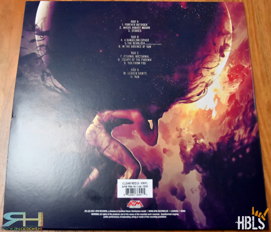
The back cover has the songs titles and artwork in the well-known style of the designer artist. The inside of the gatefold has all the credit details, song lyrics, thanks you’s and also complimenting artwork.
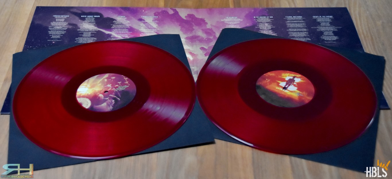
My version of the record is the Clear Red Vinyl and as we already know AFM Records likes to release different limited batches of vinyl, so the album is released in various colors. The record labels contain detail of the artwork. So the way this all is crafted together is just like the music very well done!

Next up is the new The Pretty Reckless album ‘Death By Rock And Roll’ (Century Media Records). For this release Taylor Momson and her men worked with Danny Hastings for the stunning photography and Adam Larson did the design for the whole package. Both men already worked with the band on previous albums and have a very fertile collaboration since the 2014 ‘Going To Hell’ release.
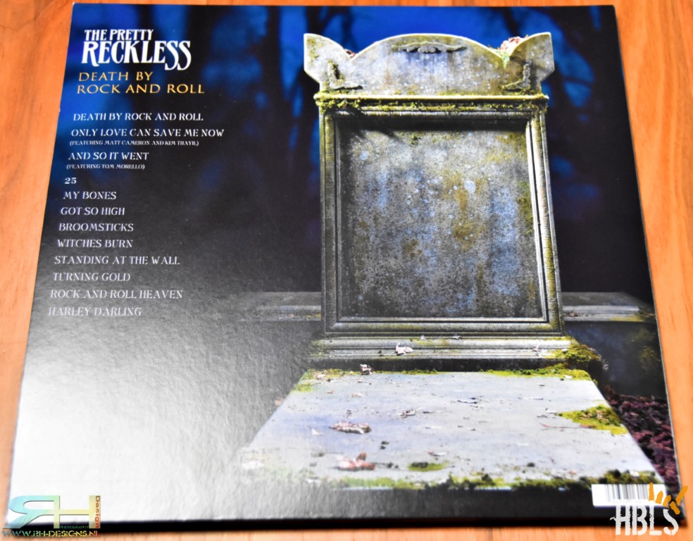
The front cover shows an image of bandleader Taylor Momson lying naked on a gravestone. Certainly a cover that grasps your attention and that is the whole idea for artwork!! When done right, it complements the artist, music and concept for the album. The back cover shows an image of a tombstone and the song titles.
The inside of the gatefold cover shows a revealing nude photo of the front woman. Lying on the same gravestone as the front cover. But in a more zoomed tasteful and certainly not cheap way. A young woman like Taylor (27), who looks like that can certainly show herself this way if she wants to. And fans of hers know that she doesn’t shy away from being naked.

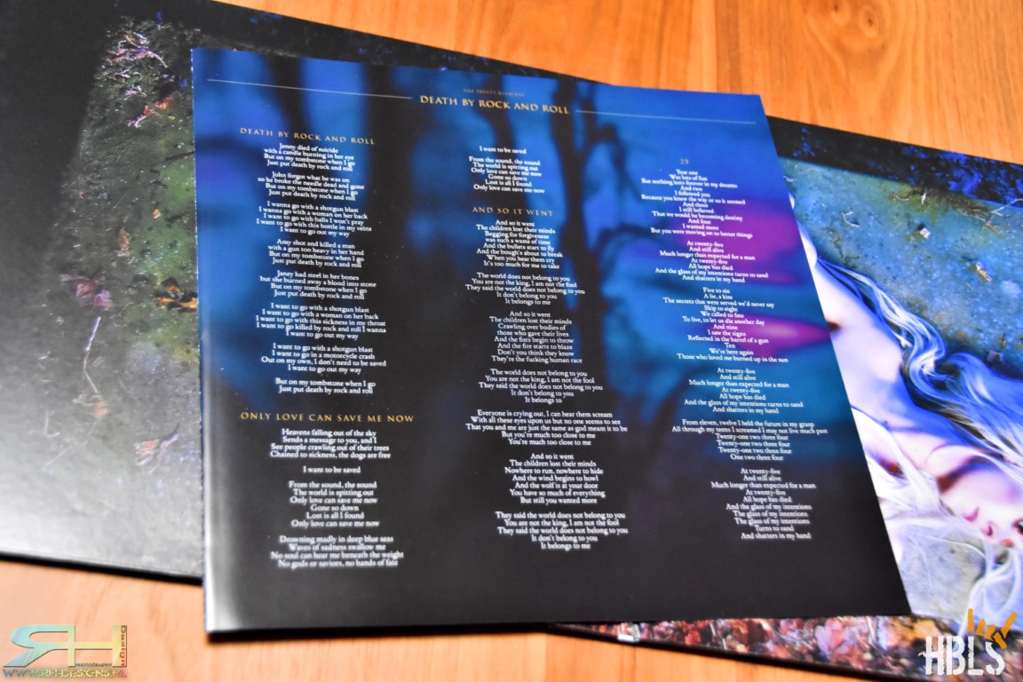
A separate 4-page inlay booklet has been chosen. Of which 3 pages for the lyrics and credits. The last page shows a photo of a beautiful guitar as a tribute to the deceased friend and long-term producer/mentor of the band, Kato Khandwala.

Three of the four sides of the 2 records are reserved for the songs, while the fourth side has an etching of the band name and album title [DXRNR]. The album was released in various colors, but I went for the ‘old school’ black edition and also comes with the entire album on cd. A release that has been well thought out and a lot of time and effort has been put into it. And yes, the music on the albums ROCKS!
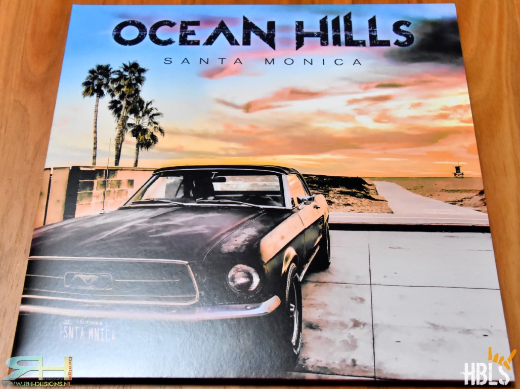
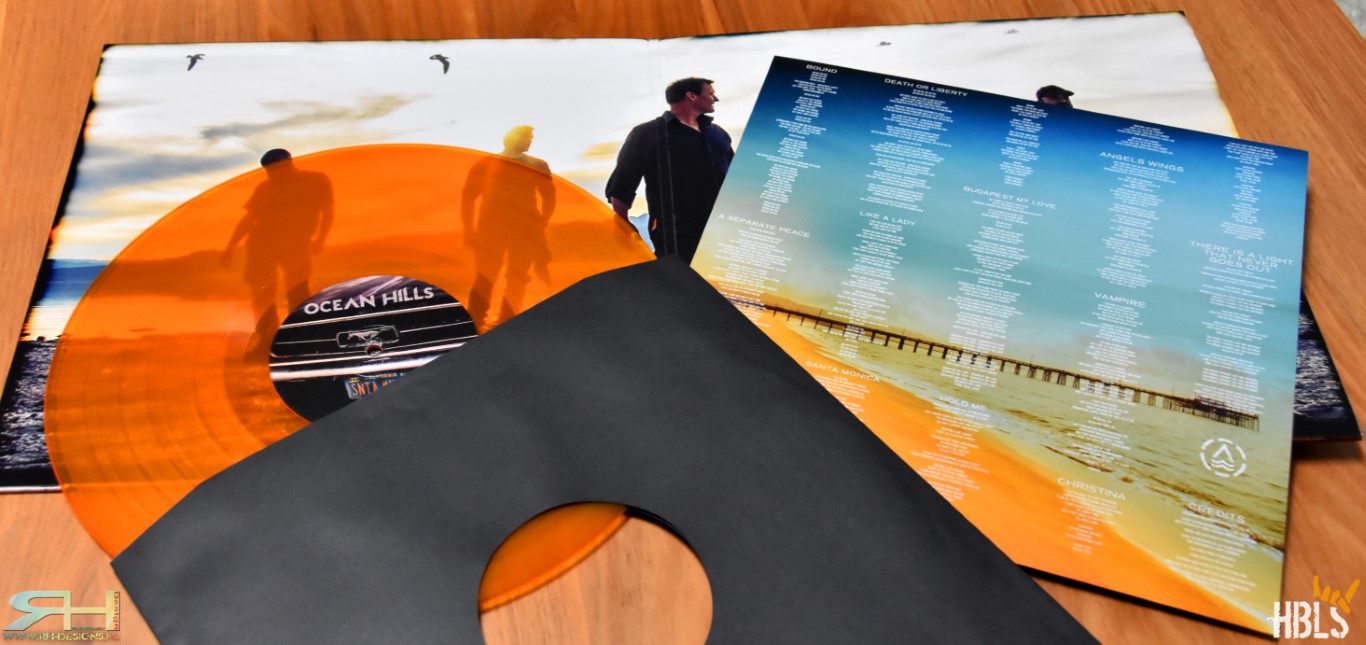
The last release of this edition of ‘The Vinyl Corner’ is from Ocean Hills. “Santa Monica” was released with a gatefold cover and in various limited colors. Mine is the clear orange version. The artwork and layout were done by Hiko [sattsign.com]. A name that regularly comes up when it comes to the artwork for AFM releases. The cover photo was made by Nils Wasko and shows us a Ford Mustang at Santa Monica beach.
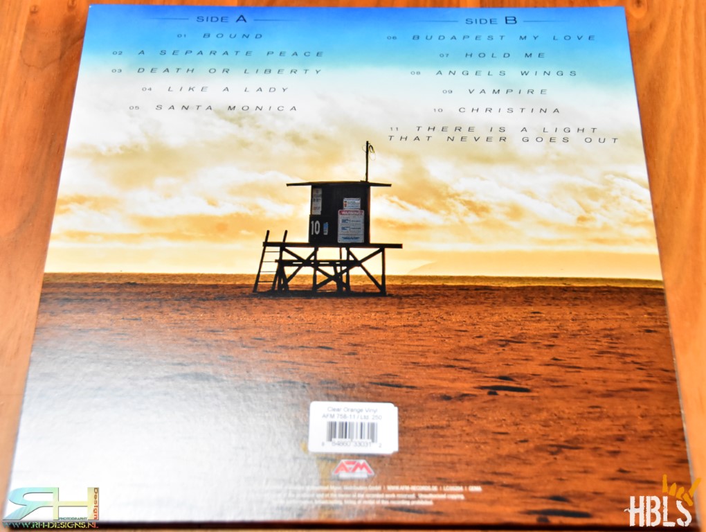
The back cover holds an image of the beach with a lifeguard cabin in the middle and the song titles. The Inside of the gatefold cover has an image of the members of Ocean Hills on the beach by Viktor Nagy and Peter Lerch. The full color inlay holds another image of the silhouettes of the band on the beach at sunset. And the Thank You’s. The other side is for the song lyrics and credits with a image of the beach and a pier in the background.
I do get why they choose this style, but to be honest, it kind a looks like a Santa Monica holiday brochure to me and not quite like the artwork of a rock album. But hey, tastes differ.
Thanks for reading and see you for a next edition of the VINYL corner.
—
HBLS review W.E.T. here
HBLS review Evergrey here
HBLS review The Pretty Reckless here
HBLS review Ocean Hills here
#theprettyreckless #oceanhills #evergrey #wet


Comments